

Impakto Games
New, used and retro games, with product condition as the primary filter.
- Client
- Impakto Games
- Sector
- E-commerce · Games
- Year
- 2026
- Scope
- Identity · UX/UI · WooCommerce development · Custom account flow
The problem
A gaming audience spots generic design from a distance and punishes it with indifference. The purple-neon cliché standardises the whole segment, so looking like everyone else is the worst possible outcome.
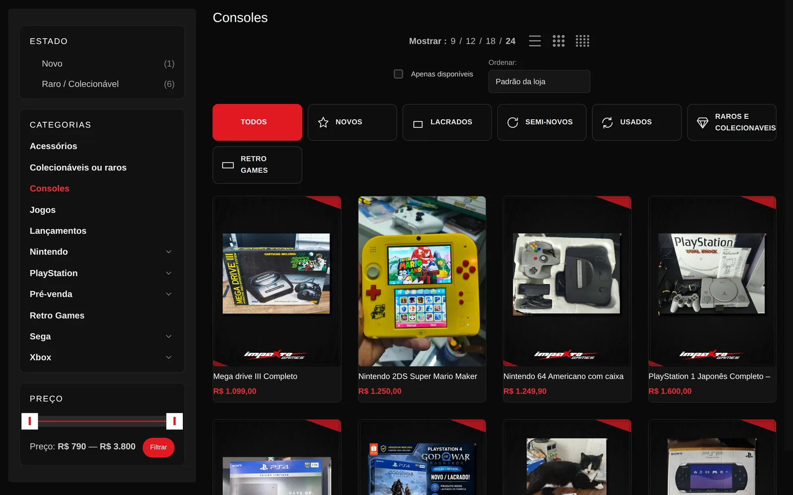
Operationally the challenge was different: a shop selling new, used, sealed and rare product needs condition to be as navigable as platform. Someone hunting a used PS2 title and someone buying a sealed PS5 release are on different journeys.
What I built
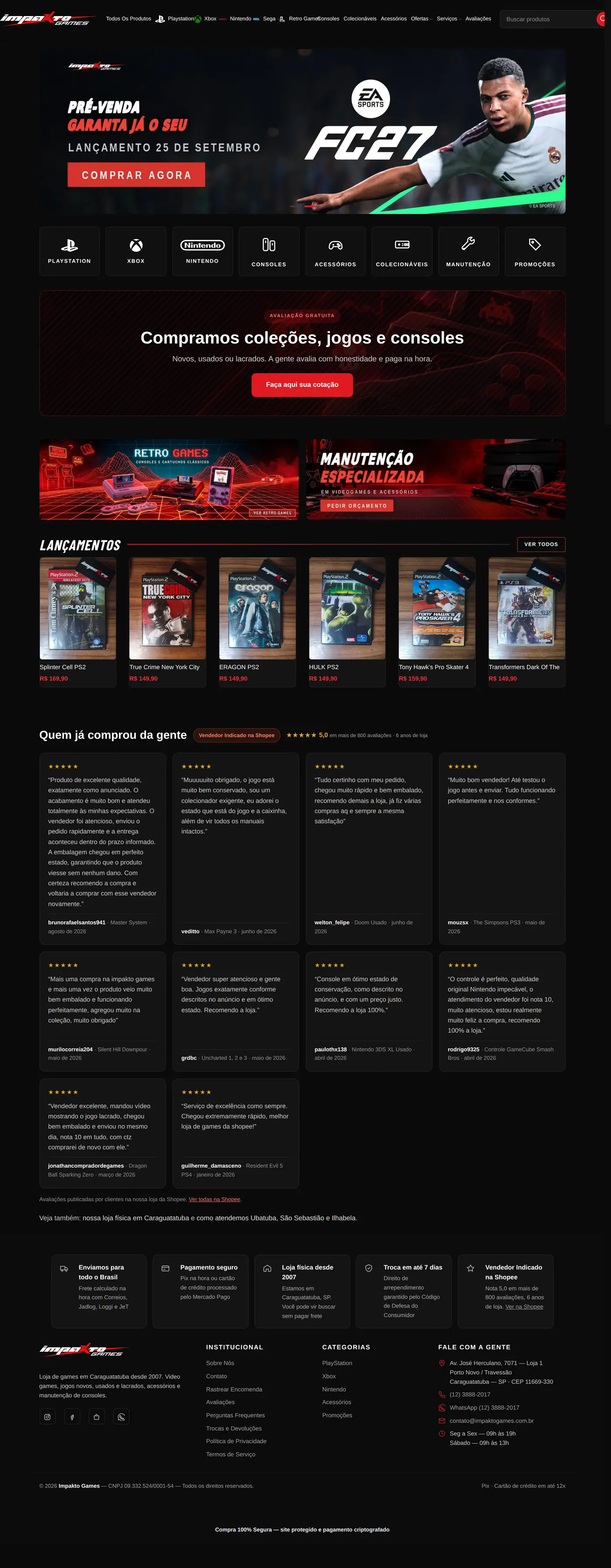
Art direction was tested in three directions and the most differentiated one won. The energy comes from typography, rhythm and attitude over a near-black ground. No excess, because excess is precisely what every competitor already does.
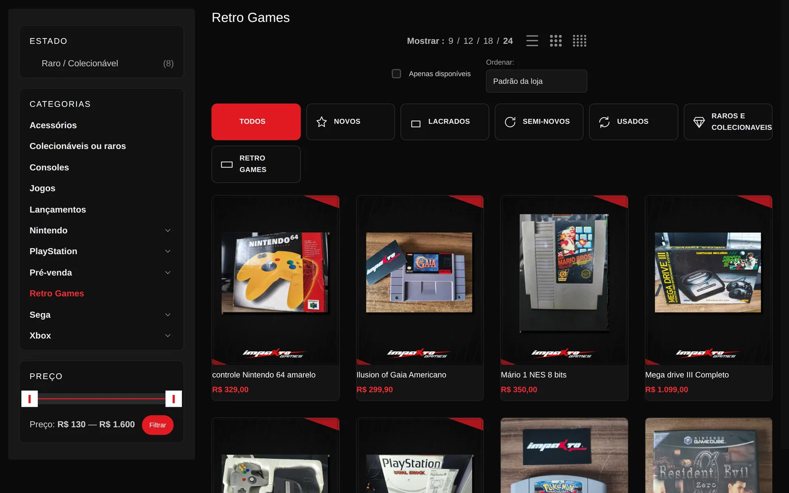
The catalogue is segmented by platform down to the specific console, from PS1 to PS5 and NES to Switch 2, with product condition as a first-class facet. The account flow is custom, with CPF, a public nickname, an explicit password rule and email confirmation, because a used-goods shop depends on identifying its buyer. Repairs, free valuation and collection buying earned a place in the navigation, since they are revenue beyond direct sales.
Personality is consistency, not effect
No neon, no glow. What creates identity is the same typographic rhythm repeated across every page, with console brand colours entering as accents rather than becoming the theme.
Service as competitive advantage
Repairs and collection buying did not get buried in the footer. They are what a nineteen-year-old physical shop has and a marketplace does not, so they went into the main navigation.
Inside

Project documentation
Art direction
A game store is excess territory — flashing banners, countdowns, sale badges over everything. I went the other way: dark grey in three layers to separate background, card and highlight without a single border, and one red, saved for the button that matters. When everything shouts, nothing is heard; the page has exactly one place the eye is pulled.
Palette
- #0A0A0A Background
- #0F0F0F Surface
- #121212 Card
- #141414 Raised
- #E01A22 Action
- #FF2B33 Action · hover
Four near-blacks separated by about three points of luminance each. Enough for the eye to read depth, little enough that no border is needed.
Why this stack
WooCommerce again, but the problem here was different: checkout. The store ships nationwide, so local payment rails are not an add-on, they are the main path, and shipping has to compare carriers live. The account flow was rewritten because Woo’s default asks for too much before a first purchase — every extra field is someone abandoning the cart.
Details
Fewer fields, more orders
I removed from signup everything that can be asked later. Checkout asks what the carrier requires and nothing beyond it.
In numbers
What was built, counted on the site itself.
product conditions as filters: sealed, new, used and rare
console families covered, down to models from Master System to Switch 2
the year the physical shop opened, and the site’s trust argument