

BMJ News
Film, games and series with the feel of a publication, not a blog.
- Client
- In-house product
- Sector
- Media · Pop culture
- Year
- 2026
- Scope
- Identity · UX/UI · Development · Editorial automation
The problem
A pop culture portal competes for seconds of attention against aggregators and against the giants of the sector. Arriving late, you do not win on raw volume, and trying to is the fastest way to become one more of the same.
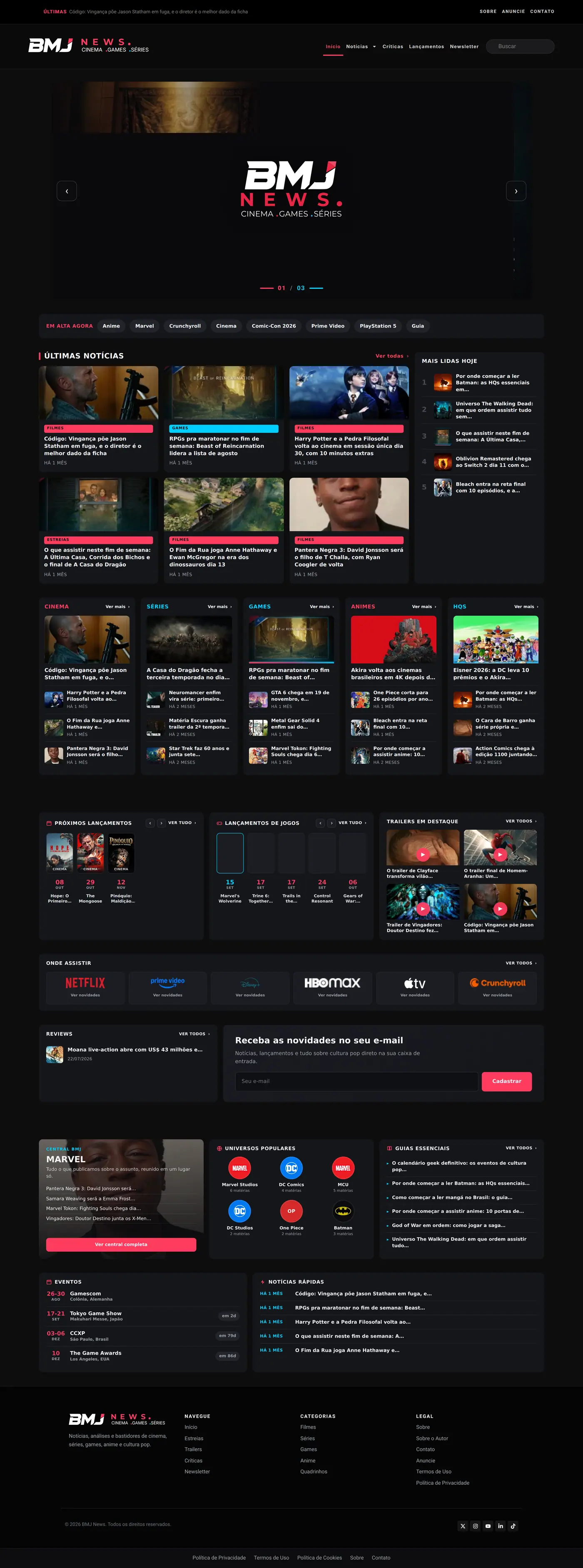
The bet was on looking like a publication: a strong front-page headline, navigable sections and a clean article page. A reader decides whether they trust a site before reading the first line.
What I built
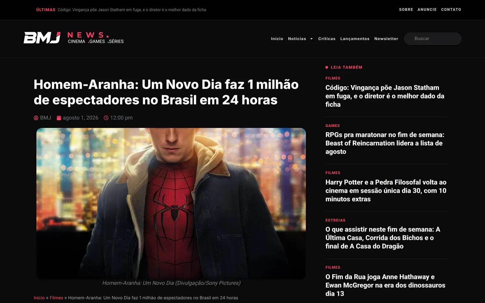
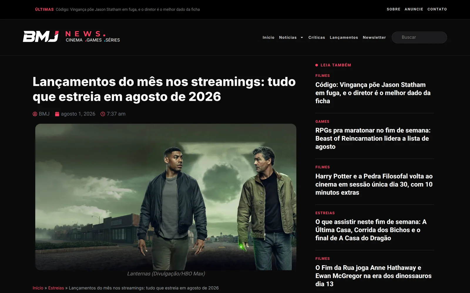
The homepage works like a magazine cover: one large headline, blocks by section, and a hierarchy that makes the lead obvious. The article page is lean and built for reading, without the wall of related blocks that interrupts more than it retains.
What sustains the cadence is the same pipeline as Escrito pela IA: researched story, draft assembled with its SEO package and cover, human review before publishing. A streaming-service filter and an industry event calendar are there as utilities, because those are the things a reader comes back to consult.
Automation in the process, human in the voice
The same rule as Escrito pela IA. The machine assembles the draft and the technical package; editorial judgement and review stay with a person. That is what makes a daily cadence possible without a team.
Inside

Project documentation
Art direction
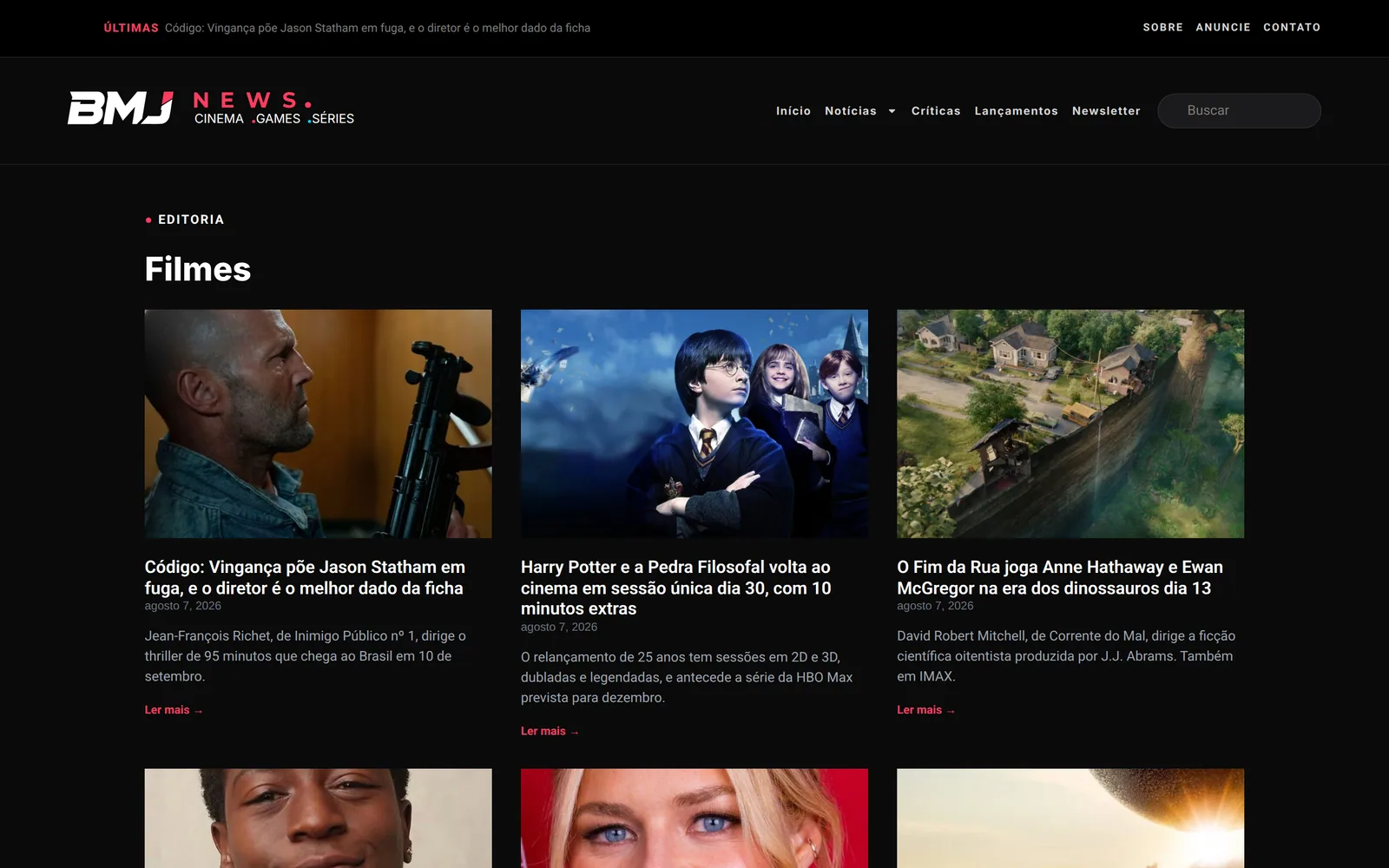
Pop culture is primed to become visual chaos: movie posters, game covers and anime art fighting on one screen. The fix was to treat the site as a gallery frame — near-black background, unadorned cards, and the artwork as the only coloured thing. The accent’s red-pink appears in no studio artwork, so it never competes with the cover.
Typography
- Aa Montserrat
Headlines and navigation. Geometric and wide, it takes uppercase without turning aggressive.
- Aa Inter
Article body and interface.
Palette
- #0B0B0E Background
- #15161B Card
- #F3F5F7 Text
- #FF3C5F Accent
Why this stack
The same engine as Escrito pela IA, pointed at a different beat. That was a decision, not laziness: one editorial pipeline, maintained in one place, feeding two portals with different sections and voice. Fixing it once fixes both.
Details
Where the two portals diverge
What differs is the source list, the voice prompt and the cover template. The rest — scheduling, SEO, publishing, featured image — is the same code.
In numbers
What was built, counted on the site itself.
sections, from film and series to anime, manga and comics
streaming services available as navigation filters
person running the entire operation